Joby Rebrand
Crafting an Electrifying New Identity
Crafting an Electrifying New Identity
Client
College Assignment
Services
Branding
Logo Design
Industries
Aviation
Date
2020
Who is Joby?
Who is Joby?
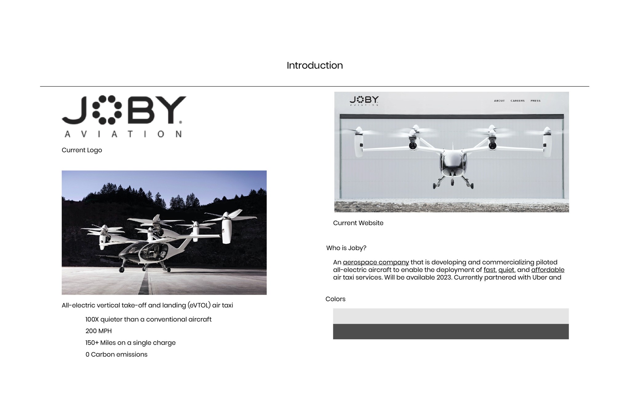
Joby is an aviation company that is developing and commercializing all-electric aircraft to enable the deployment of fast, quiet, and affordable air taxi services, currently partnered with Uber and Toyota. I designed a theoretical rebrand for a college project.

Project Brief
Project Brief
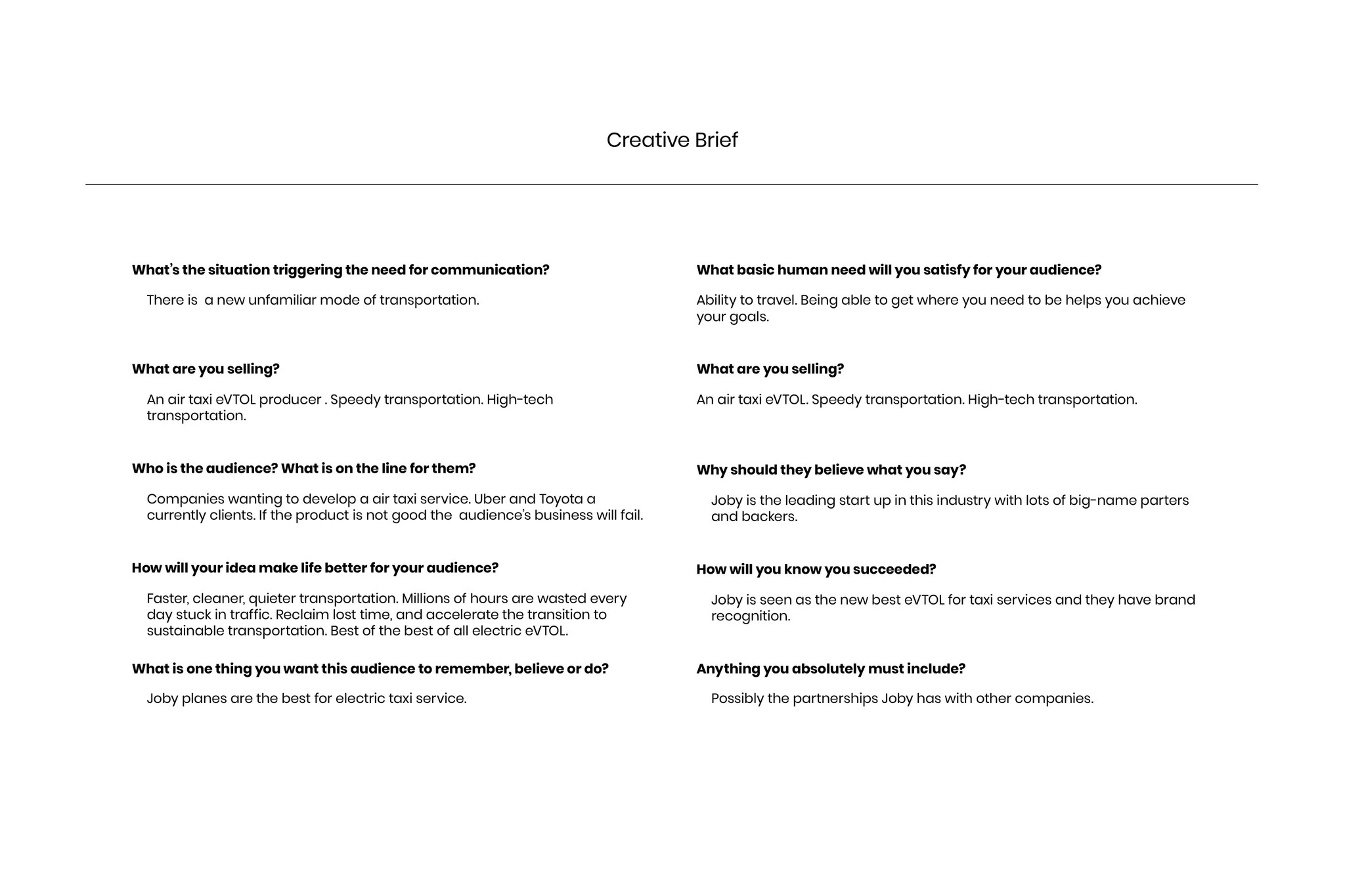
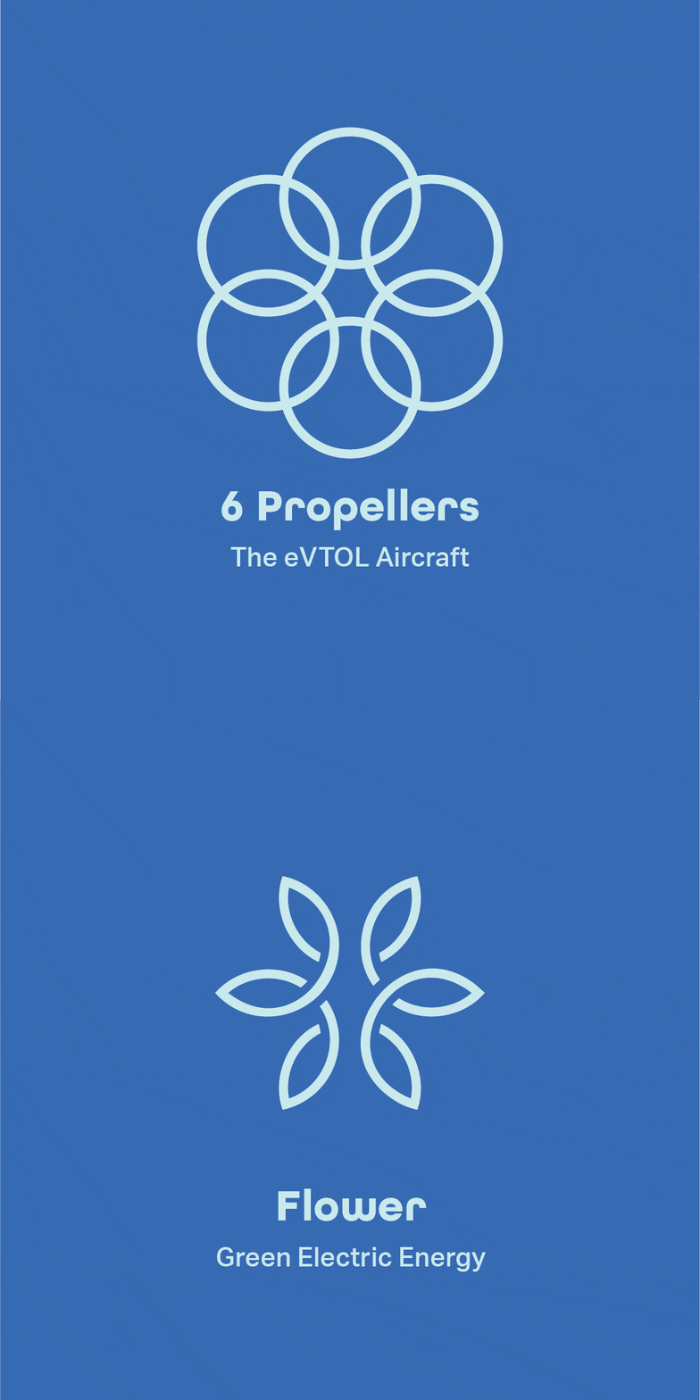
As part of my project, I was tasked with creating a rebrand for Joby. This involved designing a new logo, color palette, typography, stationery, and aircraft livery, using research and strategy to solve issues faced by Joby.

The Issue: Failing to Communicate
Creating a Symbol in the Sky
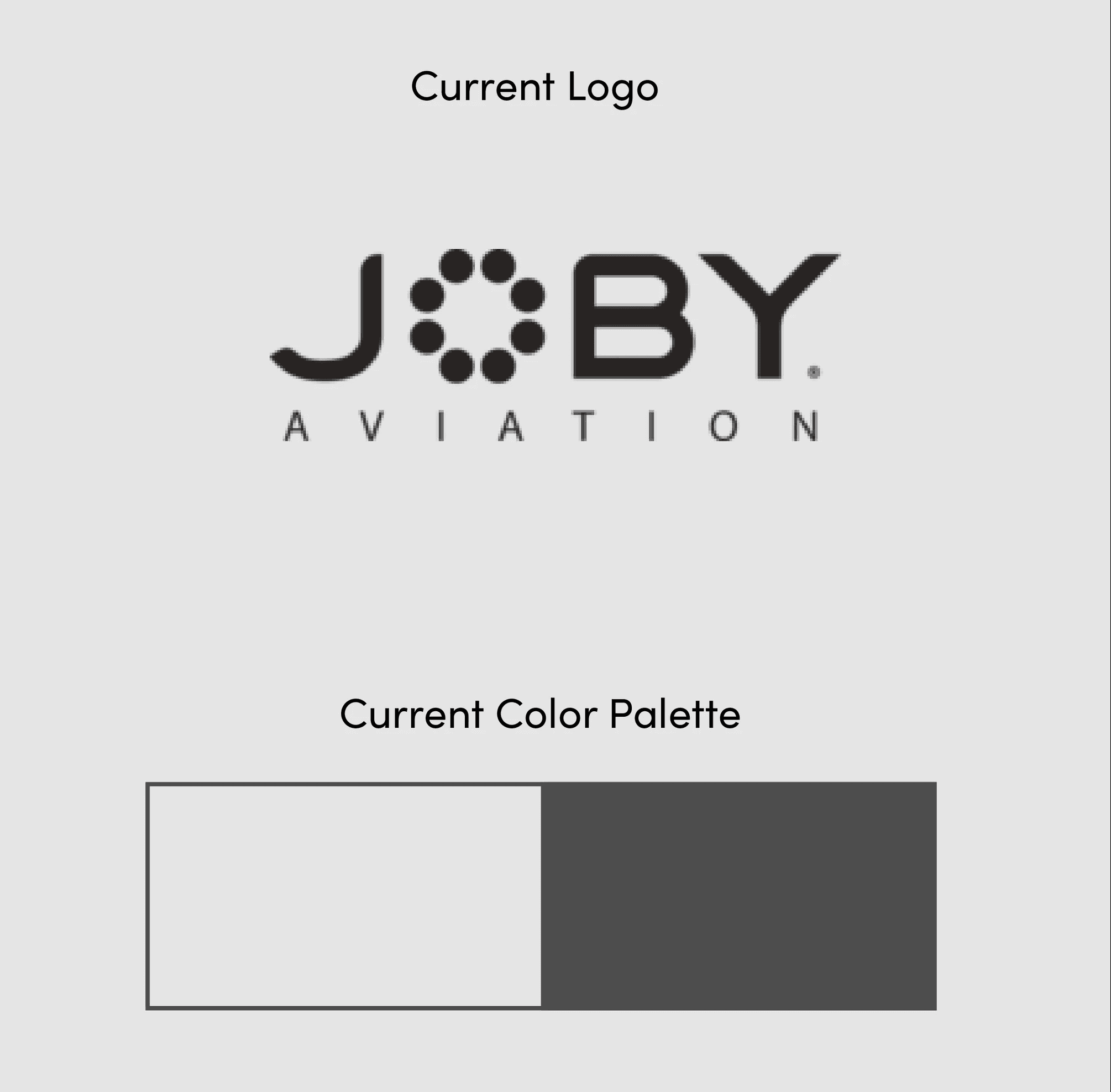
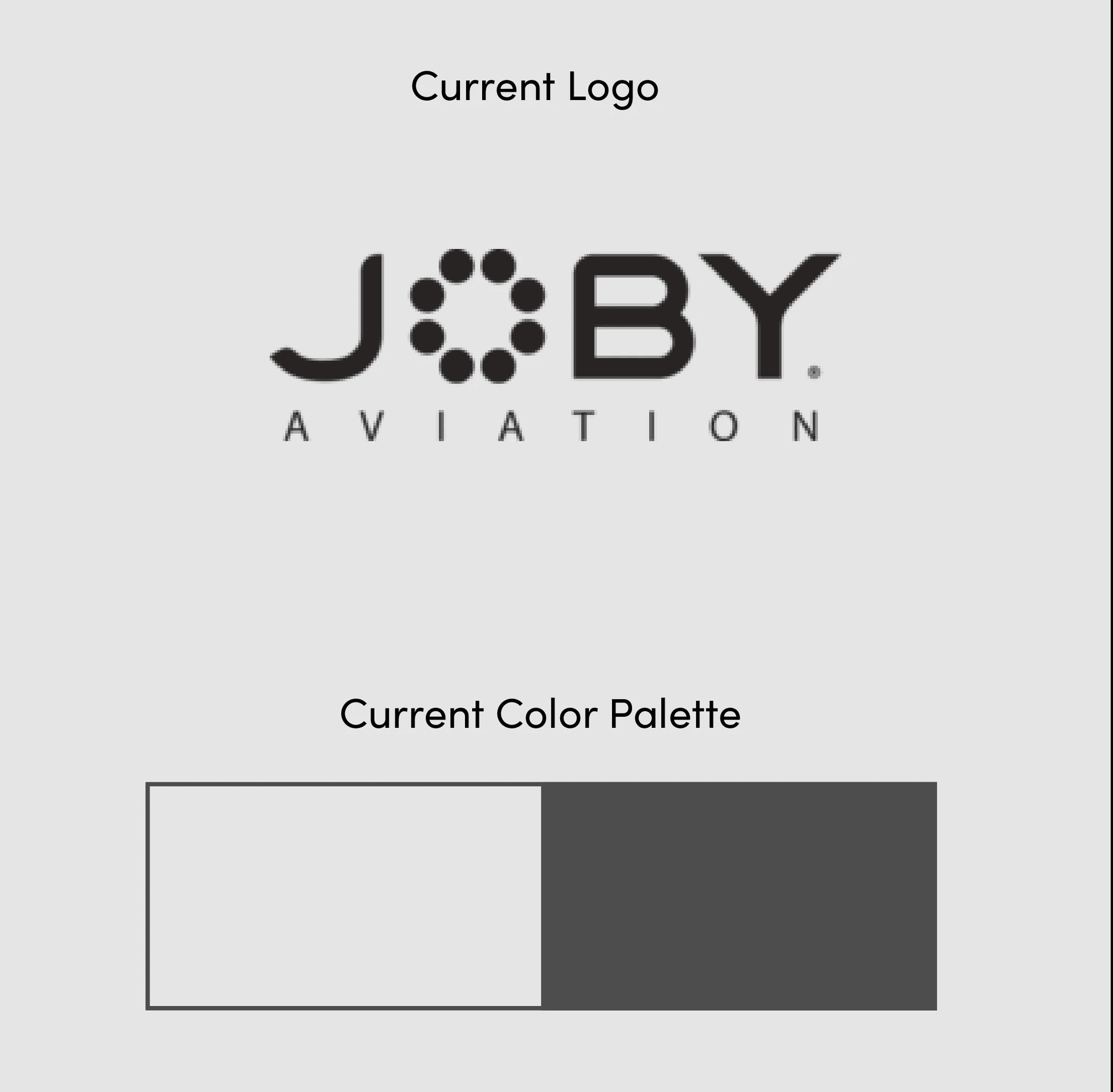
Through my research, I discovered most people are not yet familiar with Joby, and many individuals are skeptical about its safety. The color palette is dull and the logo fails to represent the company’s values and blends in with the competition.
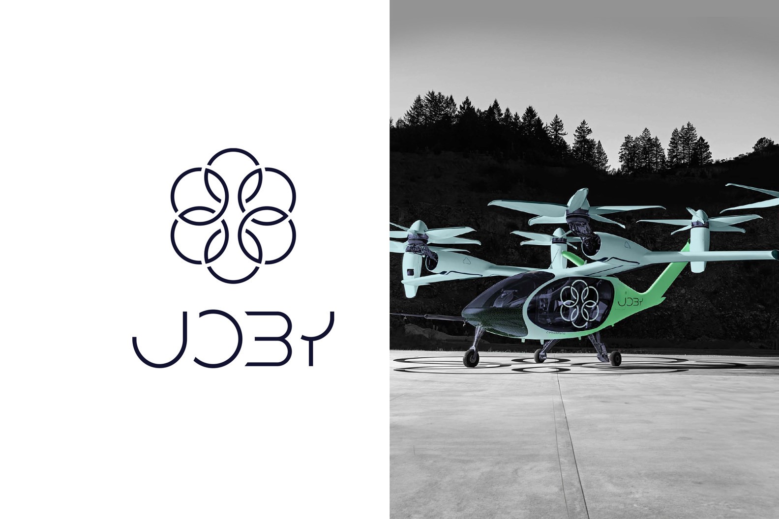
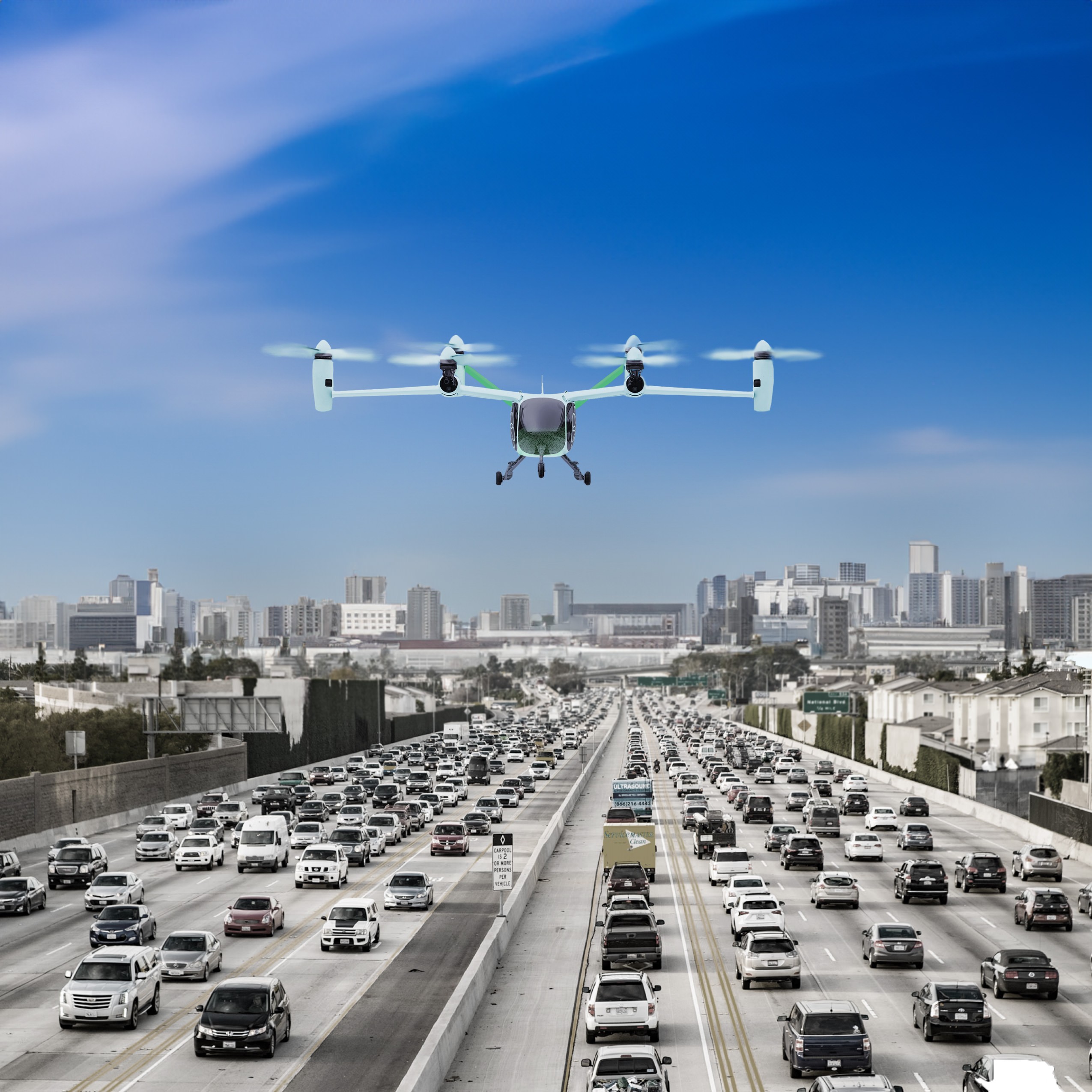
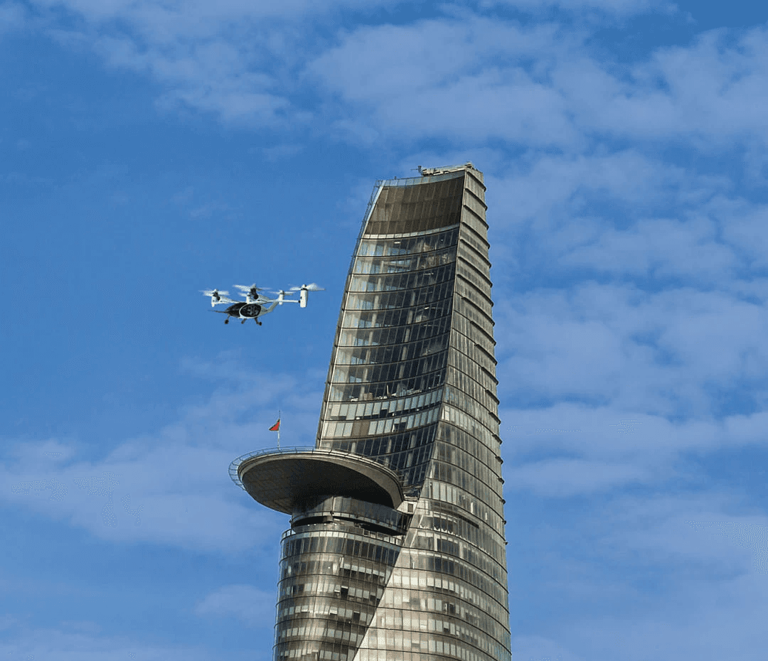
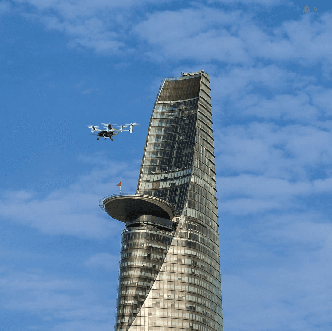
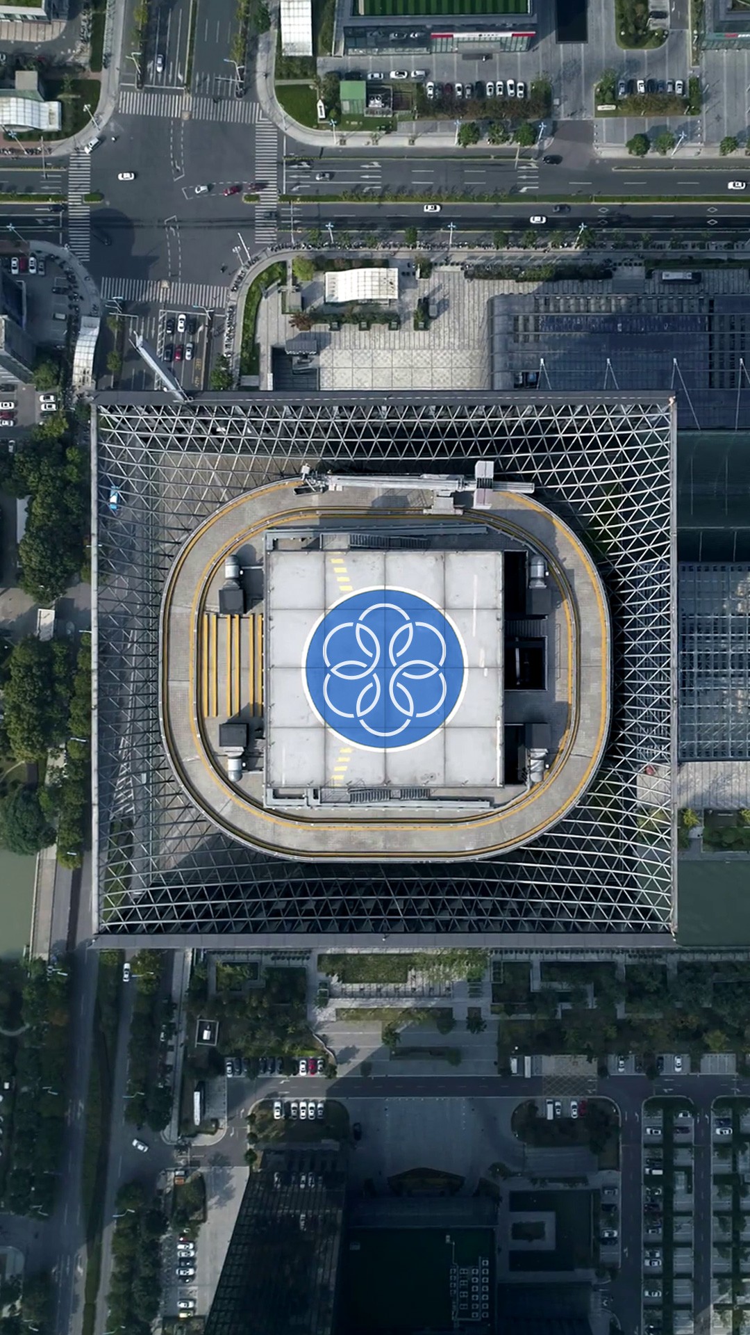
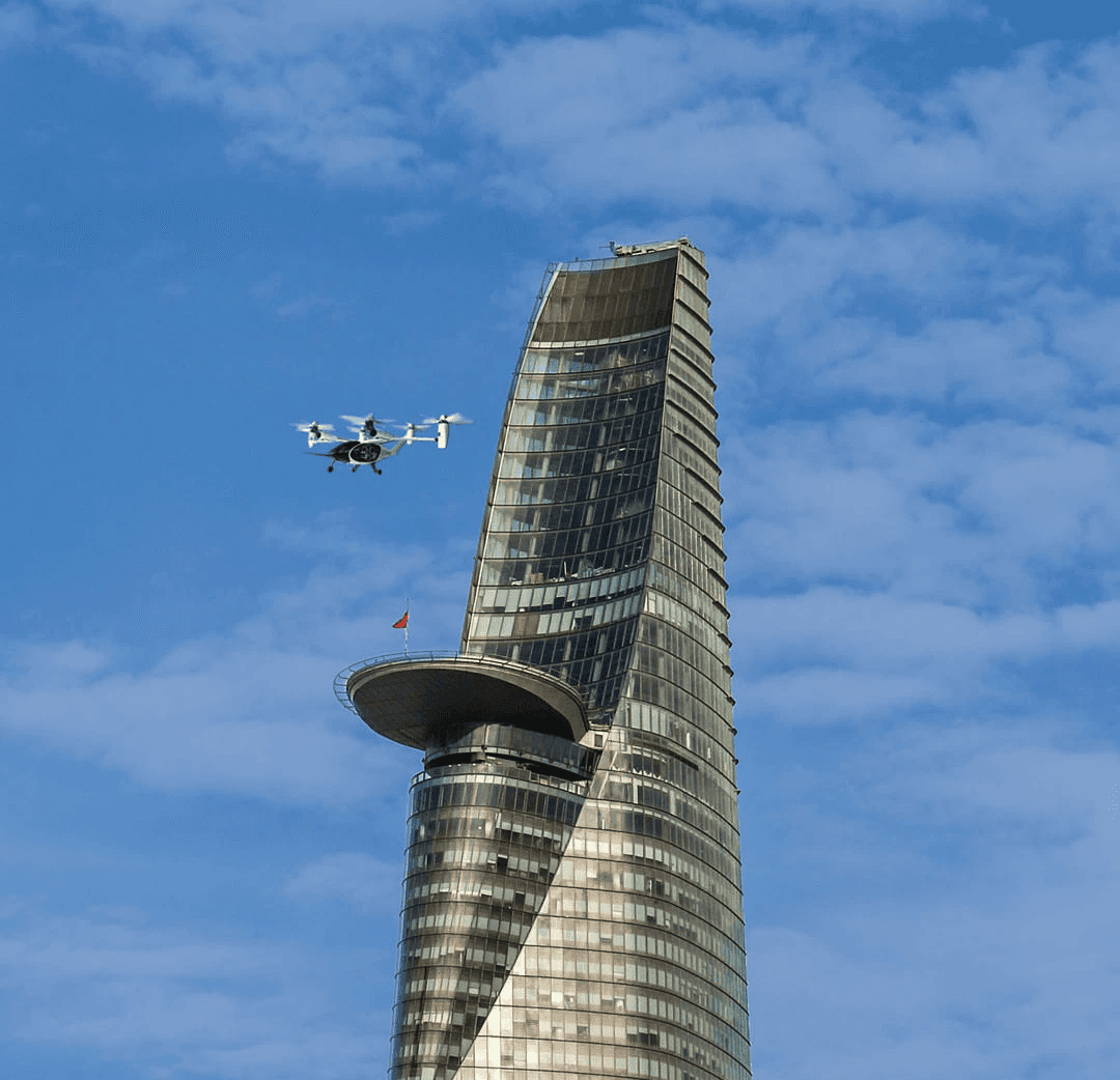
I designed the aircraft's livery because current plane lacked identity and color, so I chose to use an electric green to make the it stand out against the sky. I also added the same pattern on the stationary at the front of the aircraft to give it a unique look. Additionally, I incorporated the logo into the helipad so it was perfectly aligned and looked great.
Researching & Moodboard
Researching & Moodboard
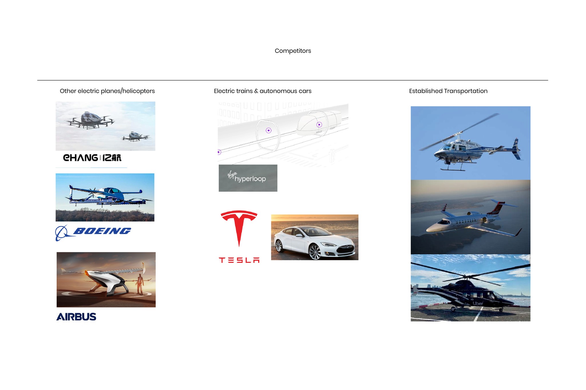
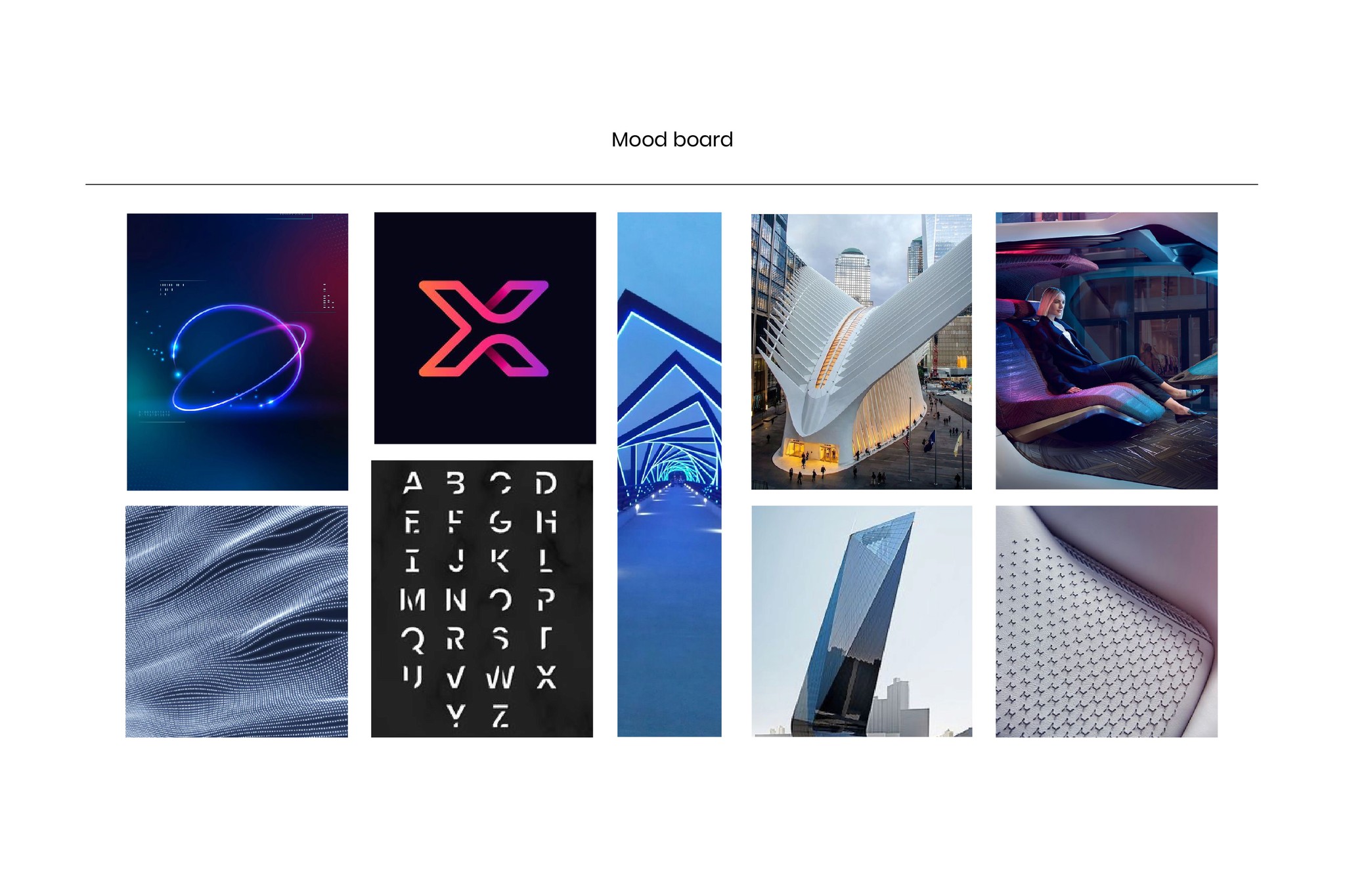
I started by learning about the company and the product, and the goals of the company. I analyzed competitors, and then created a moldboard to create an identity that stands out.I began by researching the company, product, and goals. Then, I analyzed competitors and created a mood board to establish a unique identity.
Sketching & Ideation
Sketching & Ideation
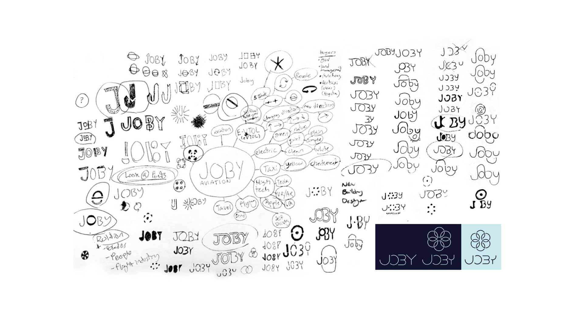
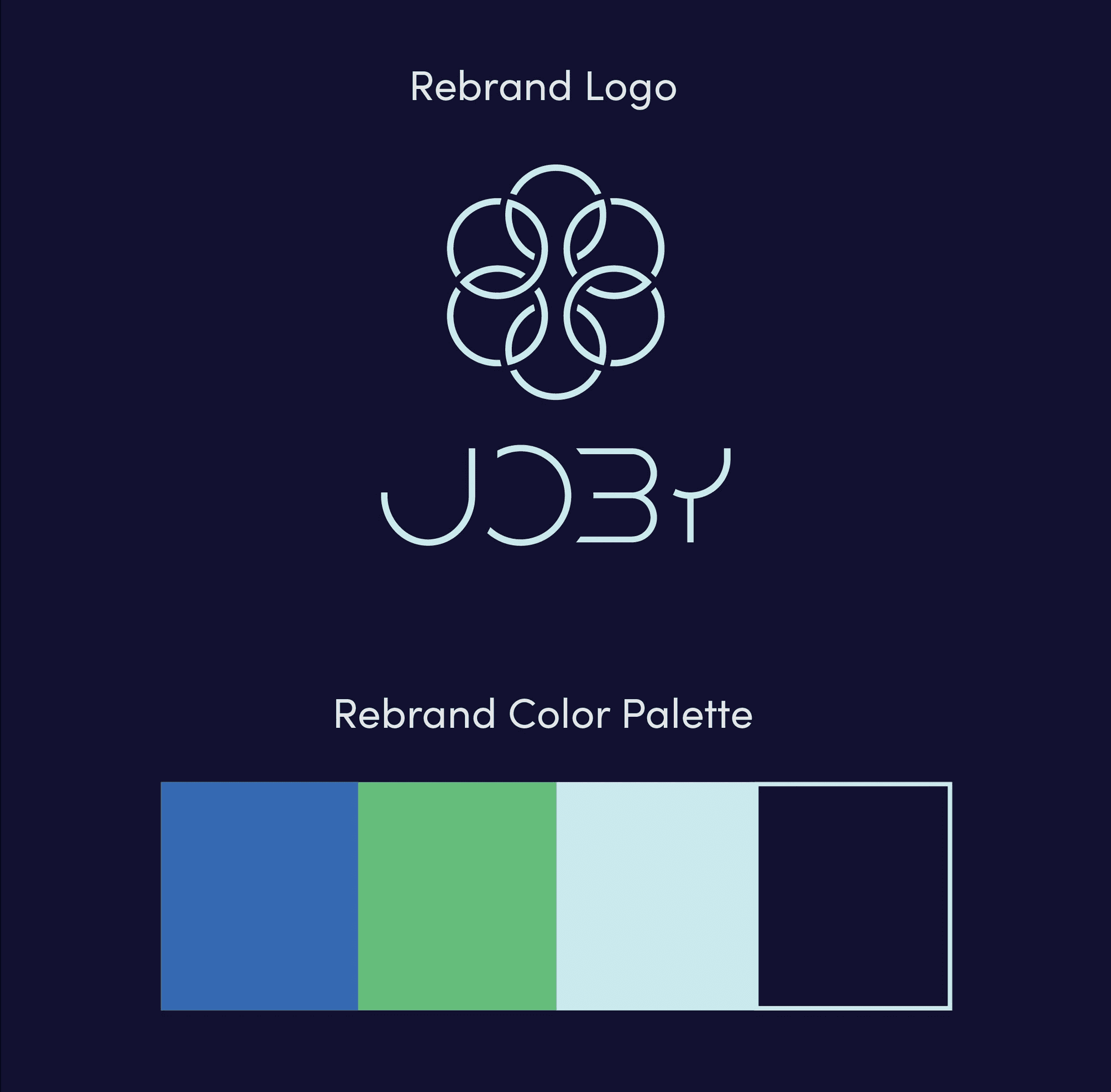
To begin with, I created a word cloud and then proceeded to sketch out some concepts. After evaluating all the concepts, I selected the best one and developed it further in Illustrator. The resulting geometric logo consists of a wordmark and an icon, which can be used together or separately as needed.
Curating Typography and Color
Curating Typography and Color
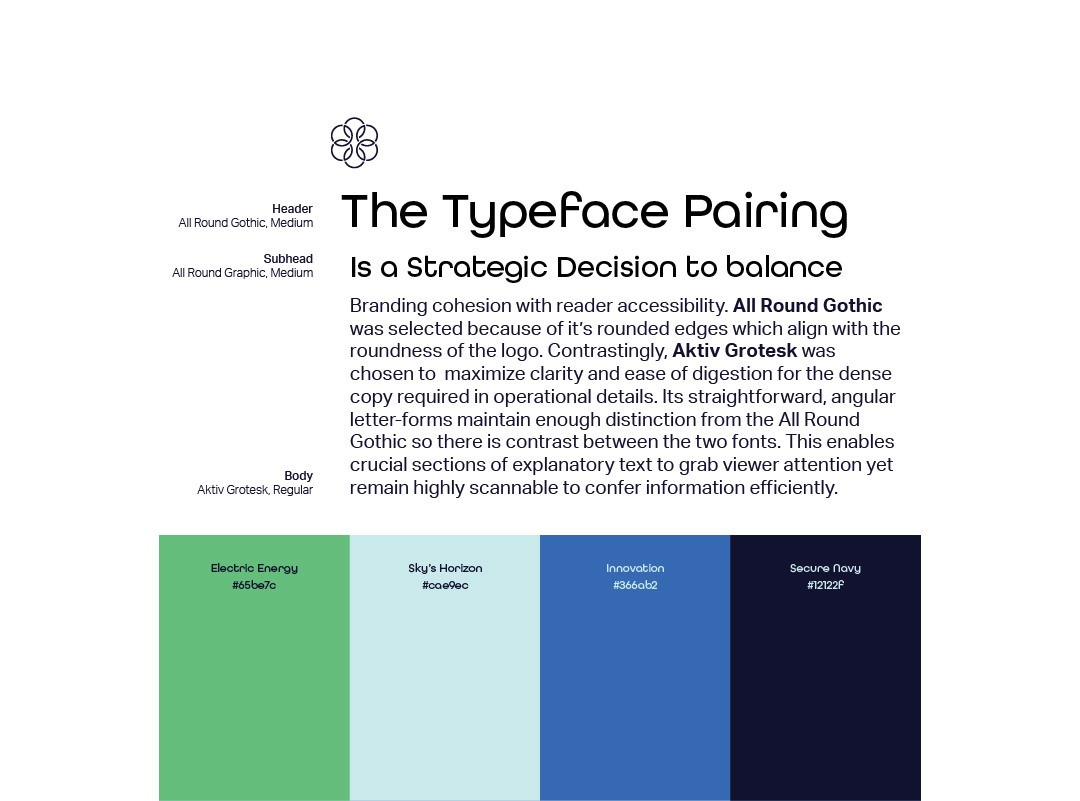
Once the logo was designed, I selected the perfect typefaces and colors for the brand, based on thorough research and a clear understanding of the brand’s goals.


Bringing Brand Identity to Stationery
The Issue: Failing to Communicate
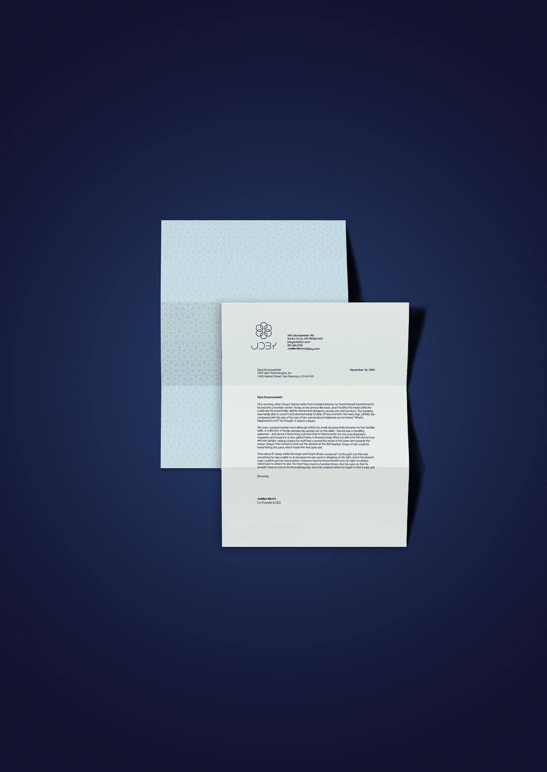
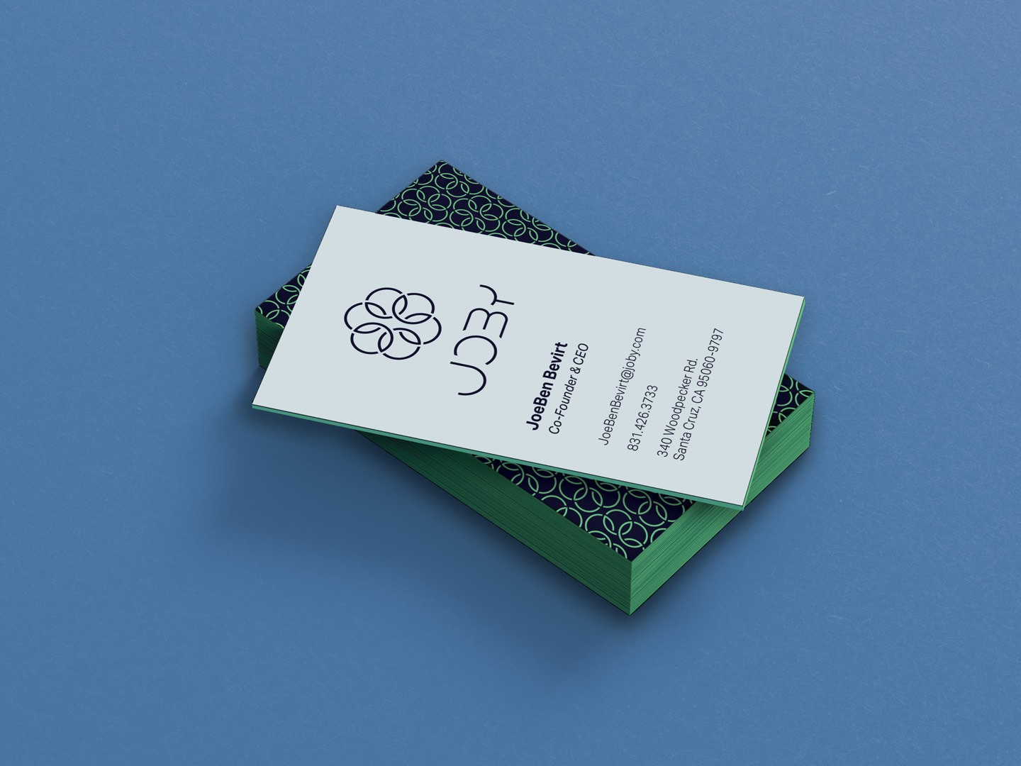
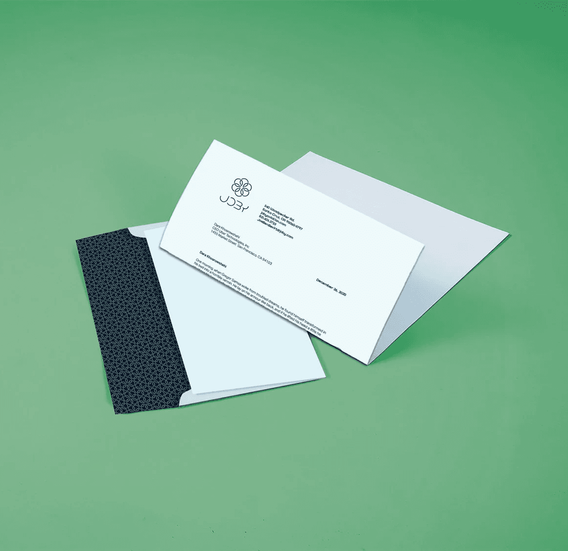
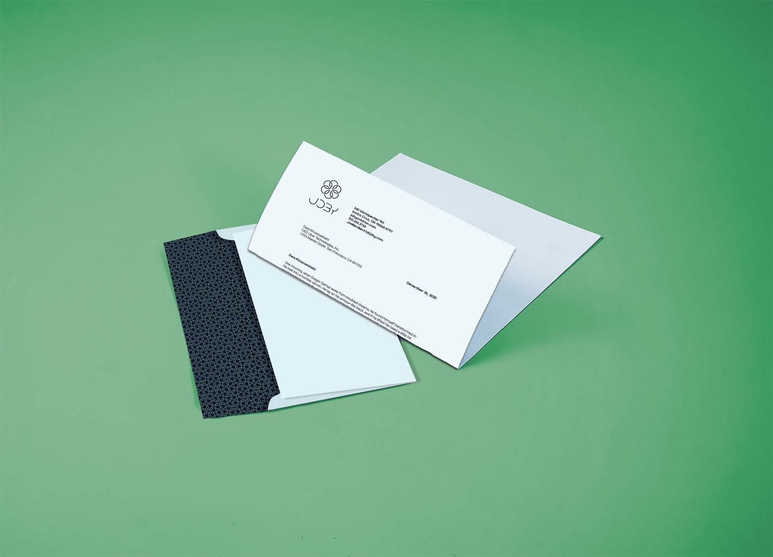
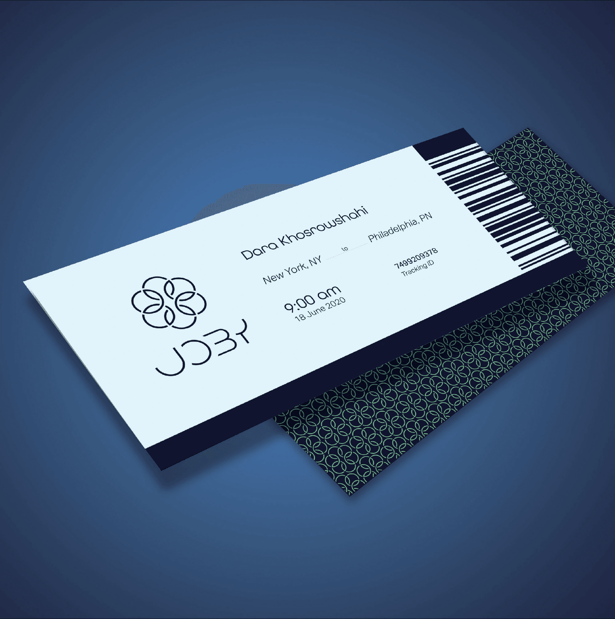
I created a set of stationery including letterhead, envelopes, and business cards, as well as a plane ticket. The design of the stationery and ticket features a unique pattern created using the brand's logo and typefaces.
Through my research, I discovered most people are not yet familiar with Joby, and many individuals are skeptical about its safety. The color palette is dull and the logo fails to represent the company’s values and blends in with the competition.

Creating a Symbol in the Sky
Bringing Brand Identity to Stationery
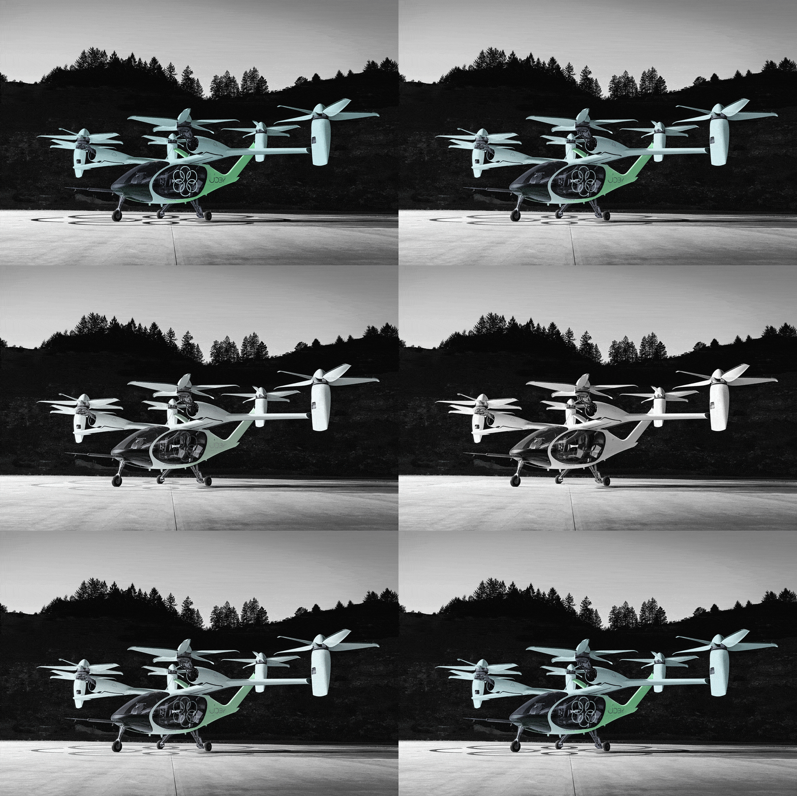
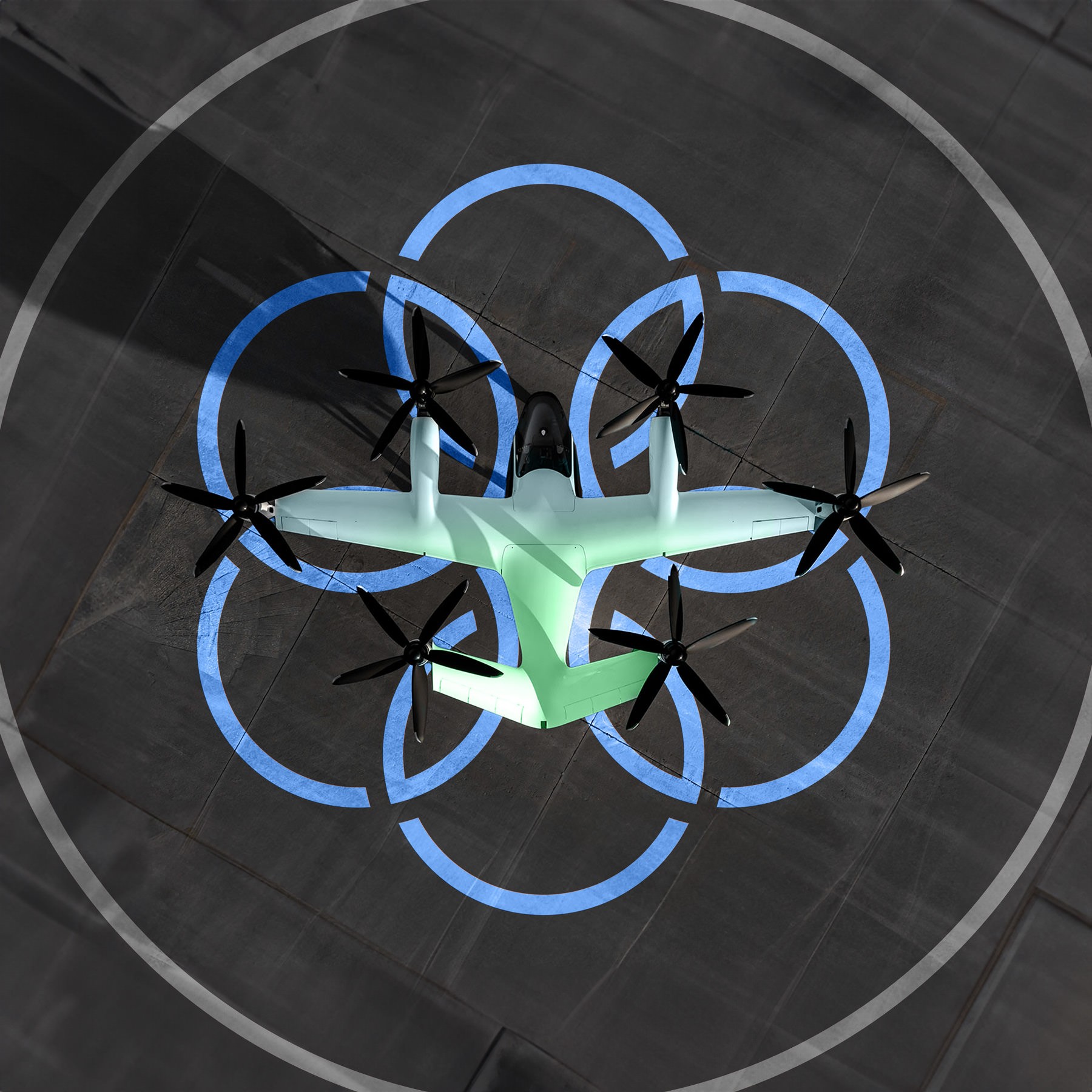
I designed the aircraft's livery because current plane lacked identity and color, so I chose to use an electric green to make the it stand out against the sky. I also added the same pattern on the stationary at the front of the aircraft to give it a unique look. Additionally, I incorporated the logo into the helipad so it was perfectly aligned and looked great.
I created a set of stationery including letterhead, envelopes, and business cards, as well as a plane ticket. The design of the stationery and ticket features a unique pattern created using the brand's logo and typefaces.


© 2024 Julia Pamer Design
© 2024 Julia Pamer Design
Joby Rebrand
Crafting an Electrifying
New Identity
Crafting an Electrifying
New Identity


Client
College Assignment
Services
Branding
Logo Design
Industries
Aviation
Date
2020
Who is Joby?
Who is Joby?
Joby is an aviation company that is developing and commercializing all-electric aircraft to enable the deployment of fast, quiet, and affordable air taxi services, currently partnered with Uber and Toyota. I designed a theoretical rebrand for a college project.
Project Brief
Project Brief
As part of my project, I was tasked with creating a rebrand for Joby. This involved designing a new logo, color palette, typography, stationery, and aircraft livery, using research and strategy to solve issues faced by Joby.
The Issue: Failing to Communicate
The Issue: Failing to Communicate
Through my research, I discovered most people are not yet familiar with Joby, and many individuals are skeptical about its safety. The color palette is dull and the logo fails to represent the company’s values and blends in with the competition.




© 2024 Julia Pamer Design
Researching & Moodboard
Researching & Moodboard
I started by learning about the company and the product, and the goals of the company. I analyzed competitors, and then created a moldboard to create an identity that stands out.I began by researching the company, product, and goals. Then, I analyzed competitors and created a mood board to establish a unique identity.








Sketching & Ideation
Sketching & Ideation
To begin with, I created a word cloud and then proceeded to sketch out some concepts. After evaluating all the concepts, I selected the best one and developed it further in Illustrator. The resulting geometric logo consists of a wordmark and an icon, which can be used together or separately as needed.


Curating Typography
and Color
Curating Typography
and Color
Once the logo was designed, I selected the perfect typefaces and colors for the brand, based on thorough research and a clear understanding of the brand’s goals.
Bringing Brand Identity to Stationery
Bringing Brand Identity to Stationery
I created a set of stationery including letterhead, envelopes, and business cards, as well as a plane ticket. The design of the stationery and ticket features a unique pattern created using the brand's logo and typefaces.
Creating a Symbol in the Sky
Creating a Symbol in the Sky
I designed the aircraft's livery because current plane lacked identity and color, so I chose to use an electric green to make the it stand out against the sky. I also added the same pattern on the stationary at the front of the aircraft to give it a unique look. Additionally, I incorporated the logo into the helipad so it was perfectly aligned and looked great.

